Monitor
In our component library, we offer a wide range of components. To simplify the design process during project development, we have preset some styles for these components. However, you can still modify their styles based on these presets.
During the process of using the component, we can set it up according to the following steps:
1. Add Components
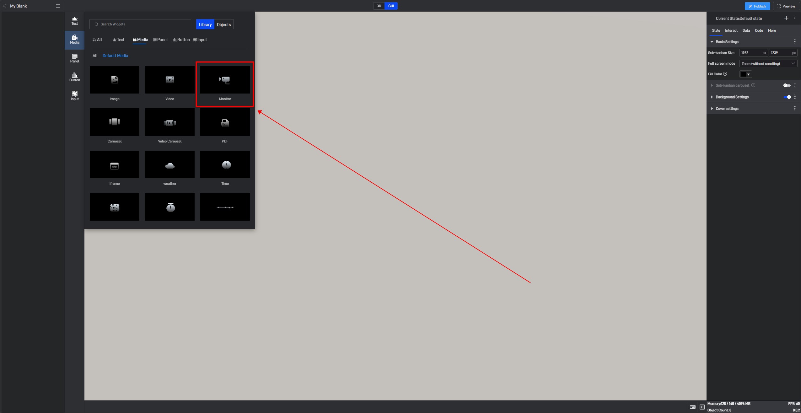
If you are not very familiar with the components, you can find the component through the Components window and then add it, as shown in the image below:
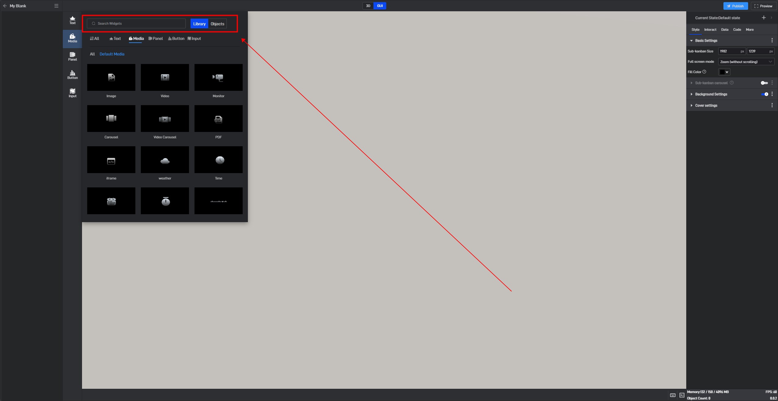
If you are more familiar with the components, you can open the search box by pressing Ctrl+F on your keyboard and search for the component you want to add.
2. Setting the Monitoring Address Through Data Fields
In a project, we sometimes need to dynamically modify the monitoring content of a monitoring component. In such cases, we can set it using the network link address method mentioned above (using this method requires the link to remain unchanged after modifying the monitoring content), or we can set it through data fields (using this method does not require the link to remain unchanged).
Since the monitoring component does not have data fields by default, we need to use the dynamic data fields feature. This feature generates an associated data field for the setting item, allowing the content of the setting item to be controlled through the data field.
Click to select the component, then move the mouse to the monitoring address setting item. You will see three dots appear on the right side. Click on them to open the extended settings menu (you can also open this menu by right-clicking).
Click on the third option: Generate Data Field.
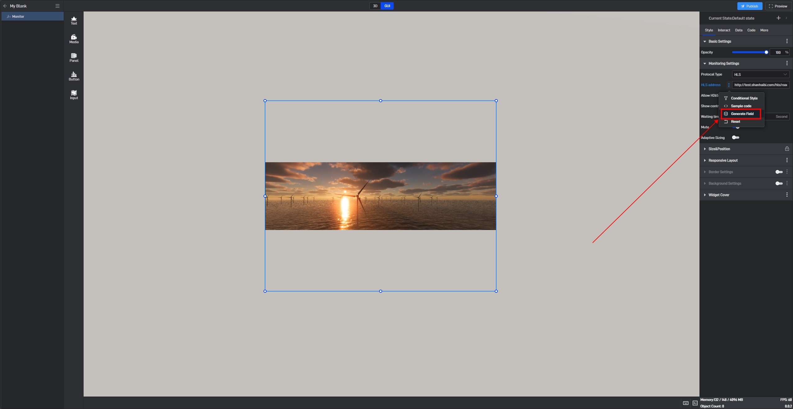
After clicking, a related data field will be generated for this setting item, and a prompt saying “Please set data field” will appear.
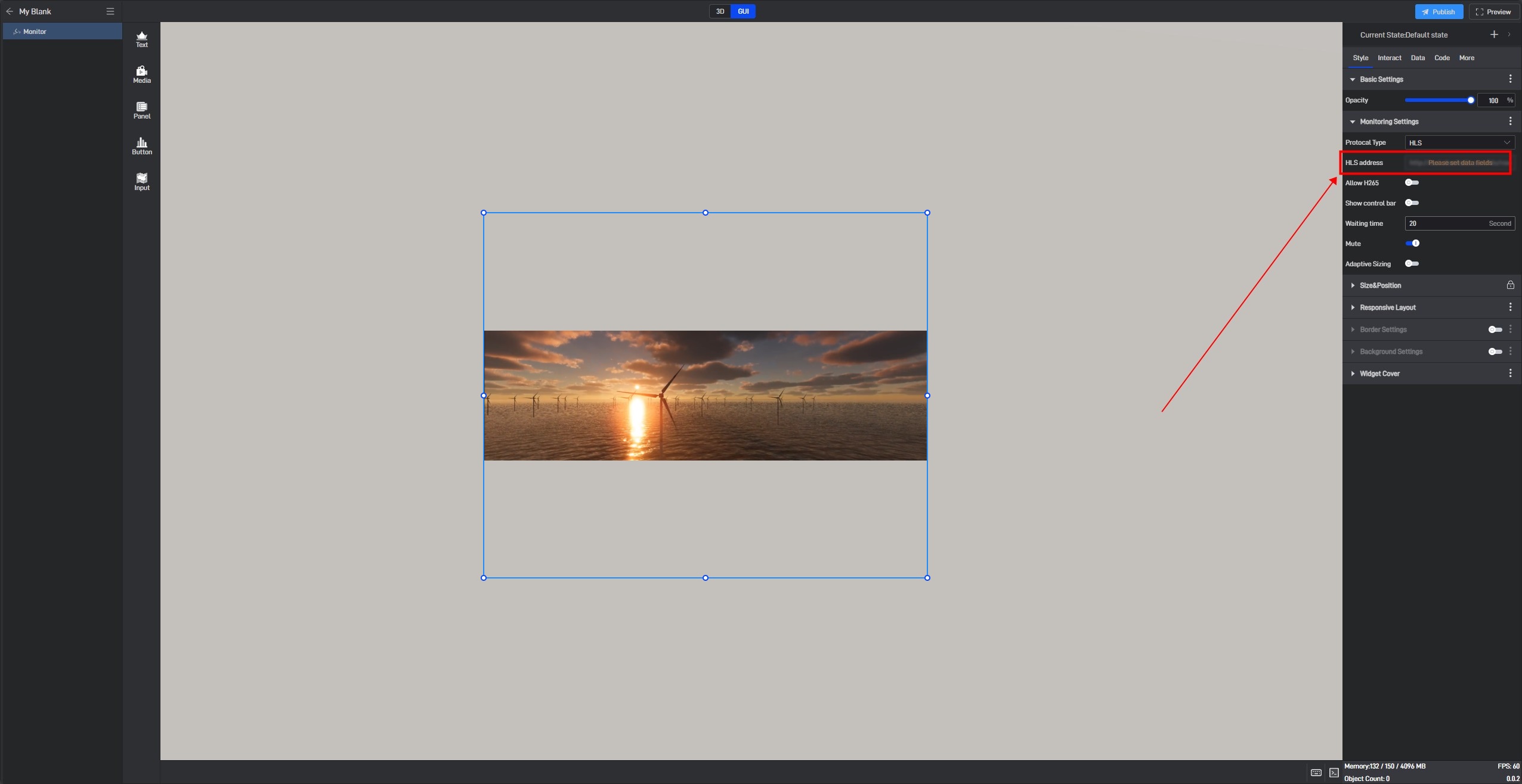
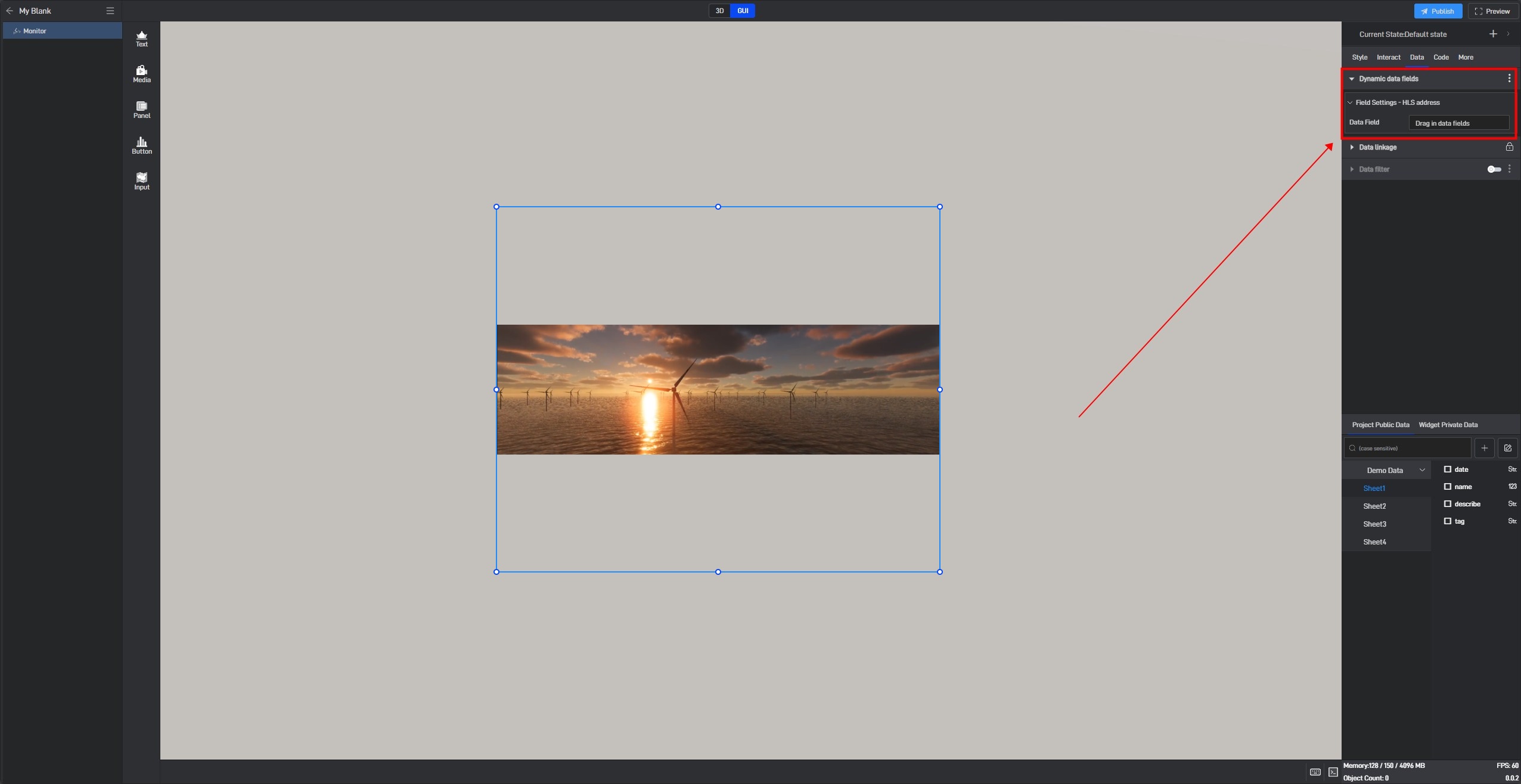
Switch to the “Data” settings window, where you will see a new dynamic data field setting item.
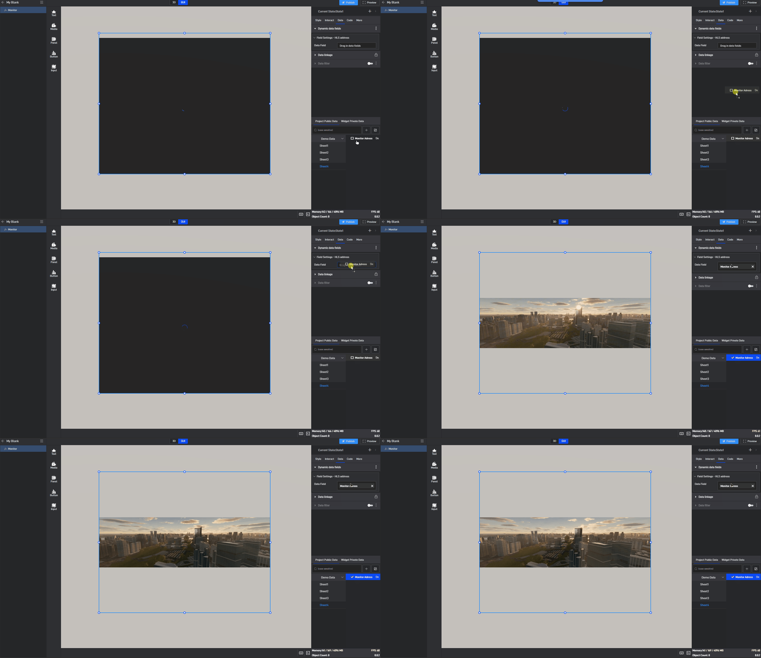
Next, drag the corresponding data field from the data source to the dynamic data field (a data source has already been added; for instructions on adding a data source, please refer to the tutorial: Add Data).
3. Set Component Styles
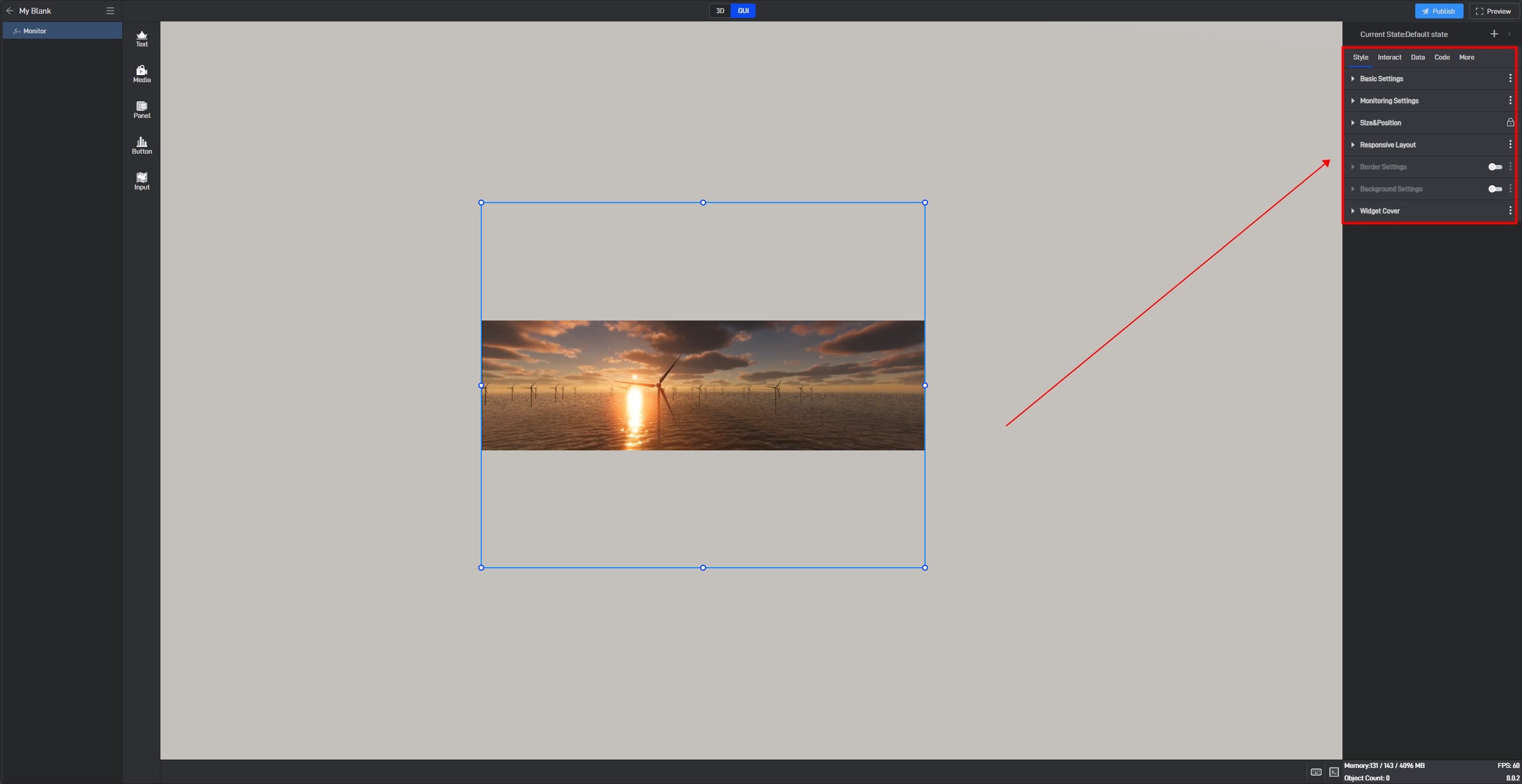
Click to select the component, and in the right-side “Style” settings window, you will see various categories of settings. Each category contains different settings, which may vary depending on the component.
3.1 Fixed Style Settings
Fixed styles refer to the component styles that remain constant once set, in contrast to conditional styles discussed in Section 3.2, which change based on data variations.
Next, we will provide a detailed introduction to each of these settings.
3.1.1 Basic Settings
| ** Configuration item ** | Describe | |
|---|---|---|
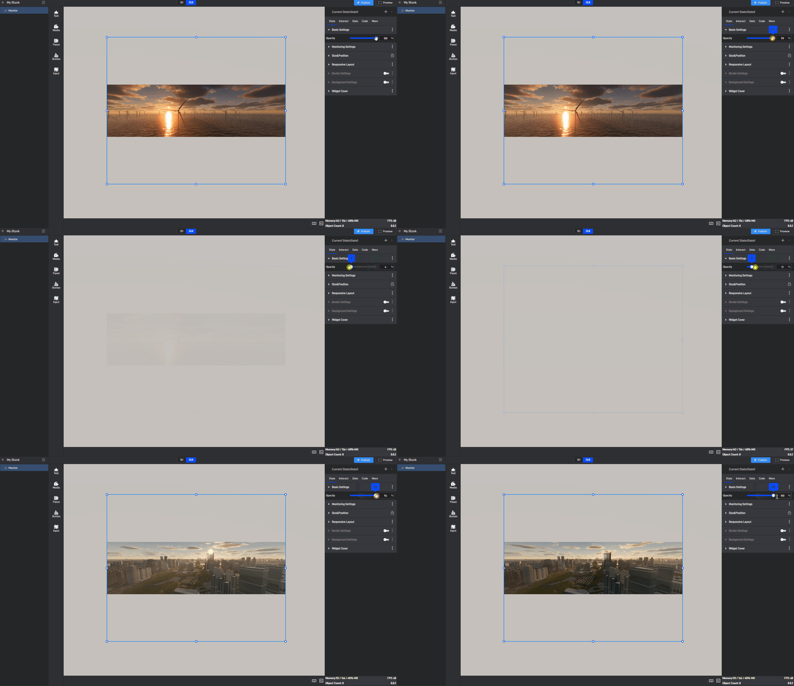
| Opacity | 1)Using transparency according to personal preference or overall harmony can make the large screen layout more aesthetically pleasing.; | 2)A common use for this setting is to combine it with conditional styles/interactions/multi-state to achieve the display and hiding of components. |
Transparency changes of the Image, as shown in the figure below:
3.1.2 Monitoring Settings
In the monitoring settings, different monitoring protocol types require the configuration of different information. Below, we will explain each monitoring protocol type individually.
| ** Configuration item ** | Describe |
|---|---|
| Protocol Types | Supports HLS, RTSP, RTMP, and FLV protocols. |
| HLS Monitoring URL | The HLS monitoring URL can usually be found in the HLS server’s configuration file. The monitoring component will display the corresponding monitoring video based on the address entered here. |
| Show Control Bar | When enabled, clicking on the monitoring component will display functions such as pause buttons, progress bars, and fullscreen options. |
| Hide and Destroy Waiting Time | The time the monitoring component continues playing in the background after being hidden. If this time is set relatively long, switching back shortly after hiding or switching the sub-screen will not require reloading the monitoring. |
| Mute | When enabled, the monitoring video will be muted. |
| ** Configuration item ** | Describe |
|---|---|
| RTSP Protocol Type | RTSP (Real-Time Streaming Protocol) is a real-time streaming protocol submitted as an IETF RFC standard by Columbia University, Netscape, and RealNetworks. RTSP is architecturally positioned above RTP and RTCP, using TCP or UDP for data transmission. |
| RTSP Monitoring URL | The RTSP monitoring protocol’s URL is usually the RTSP server’s URL address. The monitoring component will display the corresponding monitoring video based on the address entered here. |
| RTSP Underlying Transport Protocol Address | Since the RTSP protocol itself does not directly transmit streaming media data but relies on the services provided by the underlying transport protocol to complete the streaming media data transmission, it is necessary to select the underlying transport protocol address. The main RTSP underlying transport protocols are TCP and UDP, with options to choose UDP_MULTICAST/HTTP address types; the default is TCP. |
| Support for H265 | By default, Shanhaijing supports processing H264 encoding for monitoring. If your monitoring uses H265 encoding, you need to select this option to play the monitoring video properly. |
| Show Control Bar | When enabled, clicking on the monitoring component will display functions such as pause buttons, progress bars, and fullscreen options. |
| Hide and Destroy Waiting Time | The time the monitoring component continues playing in the background after being hidden. If this time is set relatively long, switching back shortly after hiding or switching the sub-screen will not require reloading the monitoring. |
| Mute | When enabled, the monitoring video will be muted. |
| ** Configuration item ** | Describe |
|---|---|
| RTMP Protocol Type | RTMP (Real-Time Messaging Protocol) is a real-time messaging protocol developed by Adobe specifically for Flash and is not fully open. RTMP protocol generally transmits streams in FLV or F4V formats, with TCP as the underlying transport protocol. |
| RTMP Monitoring URL | The RTMP monitoring URL is usually provided by the manufacturer of the monitoring device. The monitoring component will display the corresponding monitoring video based on the address entered here. |
| Support for H265 | By default, Shanhaijing supports processing H264 encoding for monitoring. If your monitoring uses H265 encoding, you need to select this option to play the monitoring video properly. |
| Show Control Bar | When enabled, clicking on the monitoring component will display functions such as pause buttons, progress bars, and fullscreen options. |
| Hide and Destroy Waiting Time | The time the monitoring component continues playing in the background after being hidden. If this time is set relatively long, switching back shortly after hiding or switching the sub-screen will not require reloading the monitoring. |
| Mute | When enabled, the monitoring video will be muted. |
| ** Configuration item ** | Describe |
|---|---|
| FLV Protocol Type | HTTP-FLV is a streaming media transmission protocol that encapsulates audio and video data into FLV format and then transmits it to the client through the HTTP protocol. |
| FLV Monitoring URL | In most cases, the FLV monitoring URL is provided by the manufacturer of the monitoring device. The monitoring component will display the corresponding monitoring video based on the address entered here. |
| Support for H265 | By default, Shanhaijing supports processing H264 encoding for monitoring. If your monitoring uses H265 encoding, you need to select this option to play the monitoring video properly. |
| Show Control Bar | When enabled, clicking on the monitoring component will display functions such as pause buttons, progress bars, and fullscreen options. |
| Hide and Destroy Waiting Time | The time the monitoring component continues playing in the background after being hidden. If this time is set relatively long, switching back shortly after hiding or switching the sub-screen will not require reloading the monitoring. |
| Mute | When enabled, the monitoring video will be muted. |
3.1.3 Size & Position
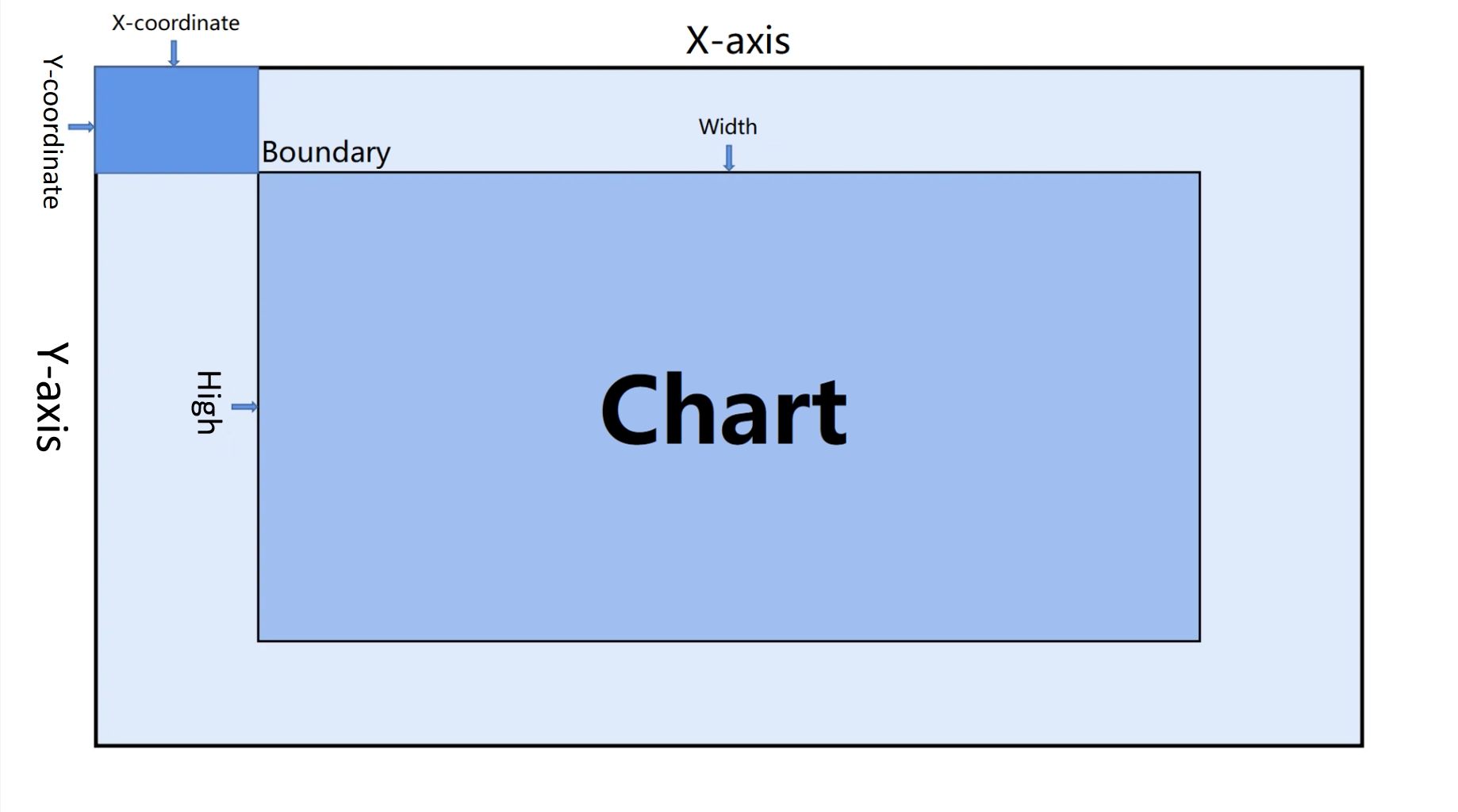
You can adjust the size and position by directly clicking and dragging the components, or by directly entering the width, height, X coordinate, and Y coordinate.
| ** Configuration item ** | Describe |
|---|---|
| Widget Size | Refers to the width and height of the component, measured in pixels (px). |
| Widget Position | Refers to the X and Y coordinates of the component. The X coordinate is the distance from the left edge of the page to the left edge of the component, while the Y coordinate is the distance from the top edge of the page to the top edge of the component. |
| Widget Rotation | In three-dimensional space, rotation can be input as any value, with the values corresponding to the angle of rotation around the X and Y axes. |
Image: Size & Position parameter diagram, as shown below:
3.1.4 Border Settings
After enabling the **”Border Settings” **button, the border style will be displayed in the component, and you will be able to configure the overall border style of the component.
| ** Configuration item ** | Describe |
|---|---|
| Color | Configure the color of the component’s border individually. |
| Width | The thickness of the component’s border, with the default width set to “1px”. |
| Corner Radius | The shape of the border, with the default radius set to “0px”. |
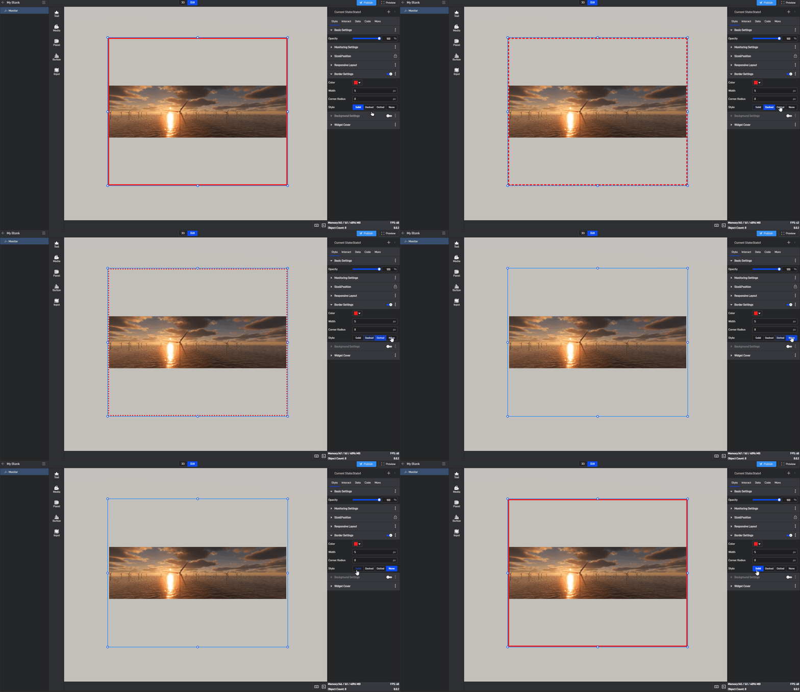
| Style | Select from four border styles: “solid” , “dashed” , “dotted” , and “none”. |
Image border style, as shown in the image below:
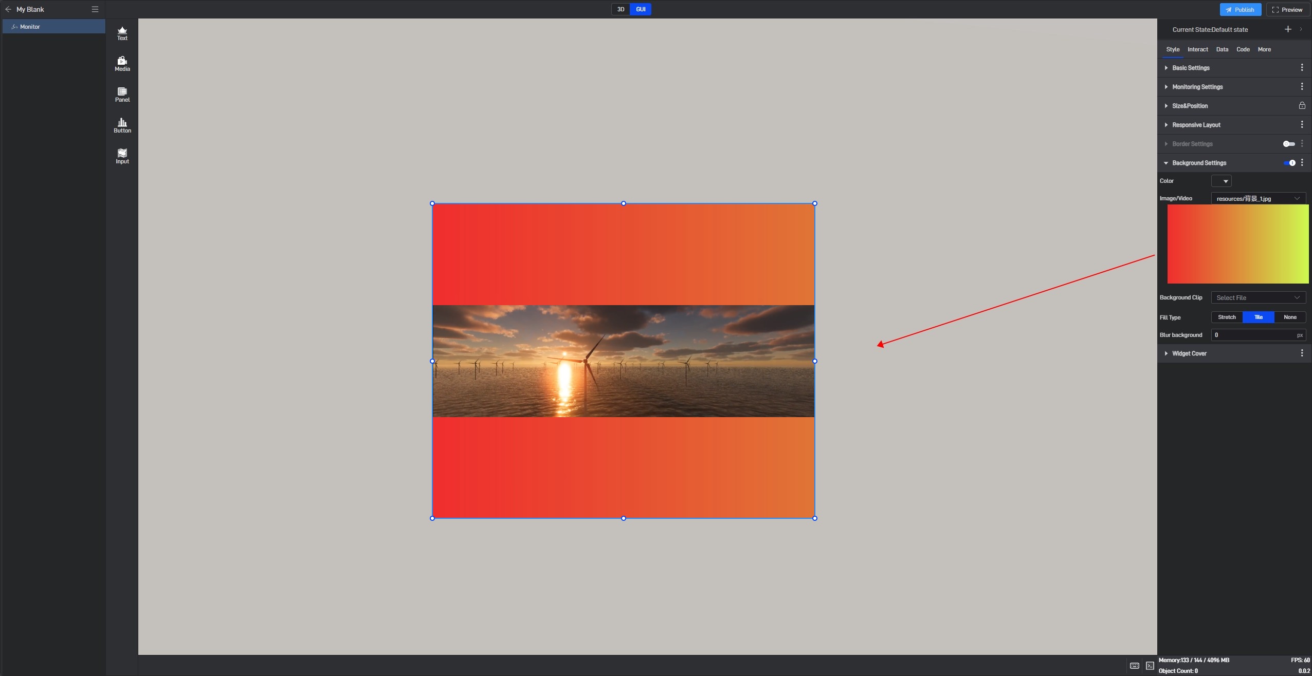
3.1.5 Background Settings
By default, components have no background color. If you need to set a background color, you must first enable the “Background Settings” option.
| ** Configuration item ** | Describe |
|---|---|
| Color | Configure the color of the component’s background separately. |
| Image/Video | Add a local image or video here to serve as the component’s background. |
| Background Clip | Crop the local image/video after adding it. |
| Fill Type | In “Stretch Fill” mode, the image will be stretched or compressed to completely cover the target area based on its size; in “Tile Fill” mode, the image will be tiled across the area while maintaining its original size and proportion. |
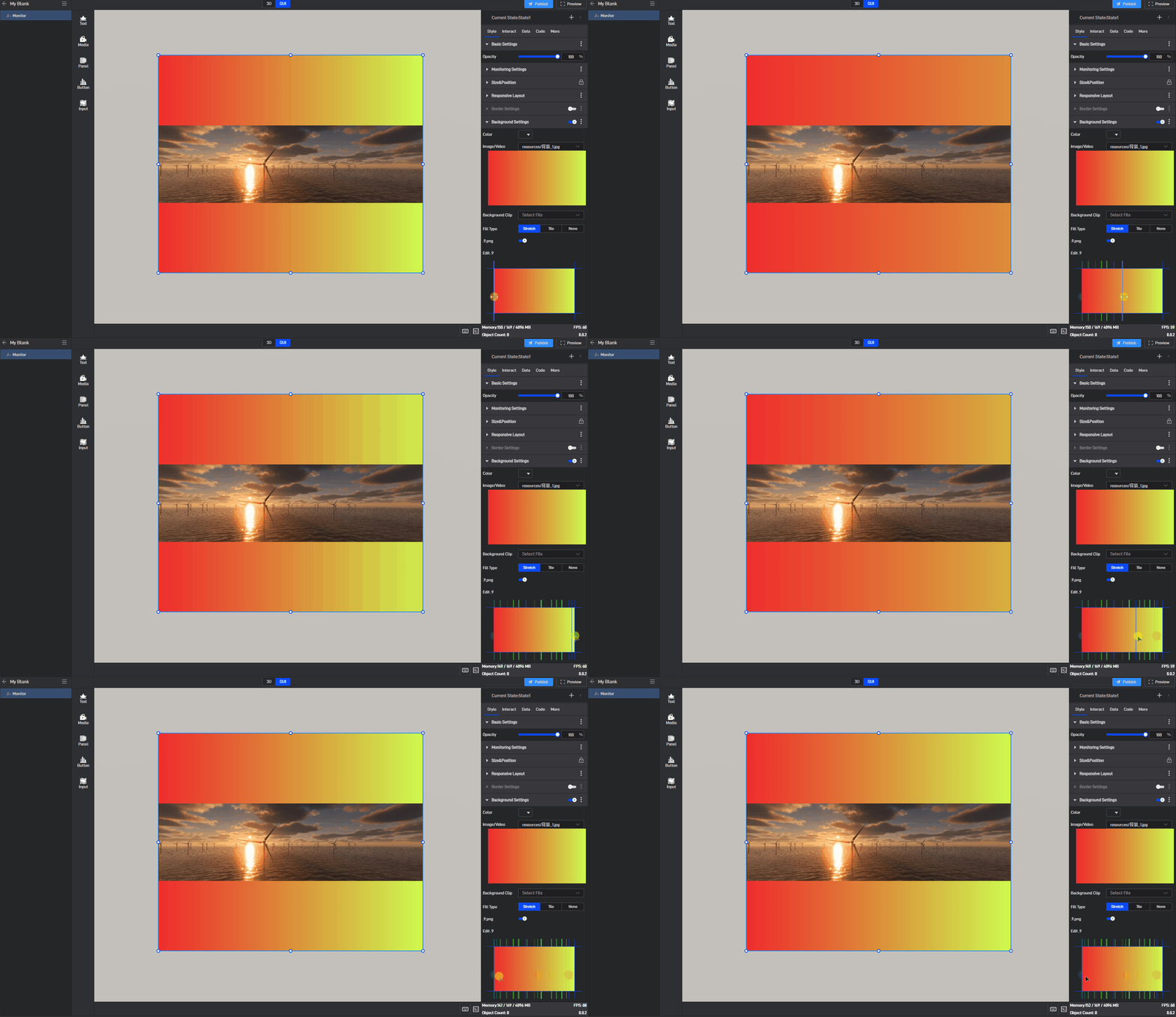
| .9. Png | Turn on this button to enable .9 scaling. |
| Edit .9 | Drag the blue pixel borders to edit and specify the area that can be stretched. |
| Blur Background | Make the background blurry or out of focus, with the default blur level set to “0px”. |
Image use .9 fill background style, as shown in the following image:
Monitor has background color styles, as shown below:
3.2. Conditional styles
Conditional styles refer to the styles of a component that change based on data conditions. (For more information on setting data conditions, please refer to the tutorial: Data Condition).
Almost all setting items can be set with conditional styles, but different setting items have slight differences when setting conditional styles. There are two specific methods:
Method 1: Set in the Extended Settings Menu
Most setting items use Method 1 for conditional settings. The specific steps are as follows:
Take the “Opacity” setting item in “Basic Settings” as an example:
Click to select the component, move the mouse over the setting item, and you will see three dots (extended settings button) appear on the right side of the setting item name.
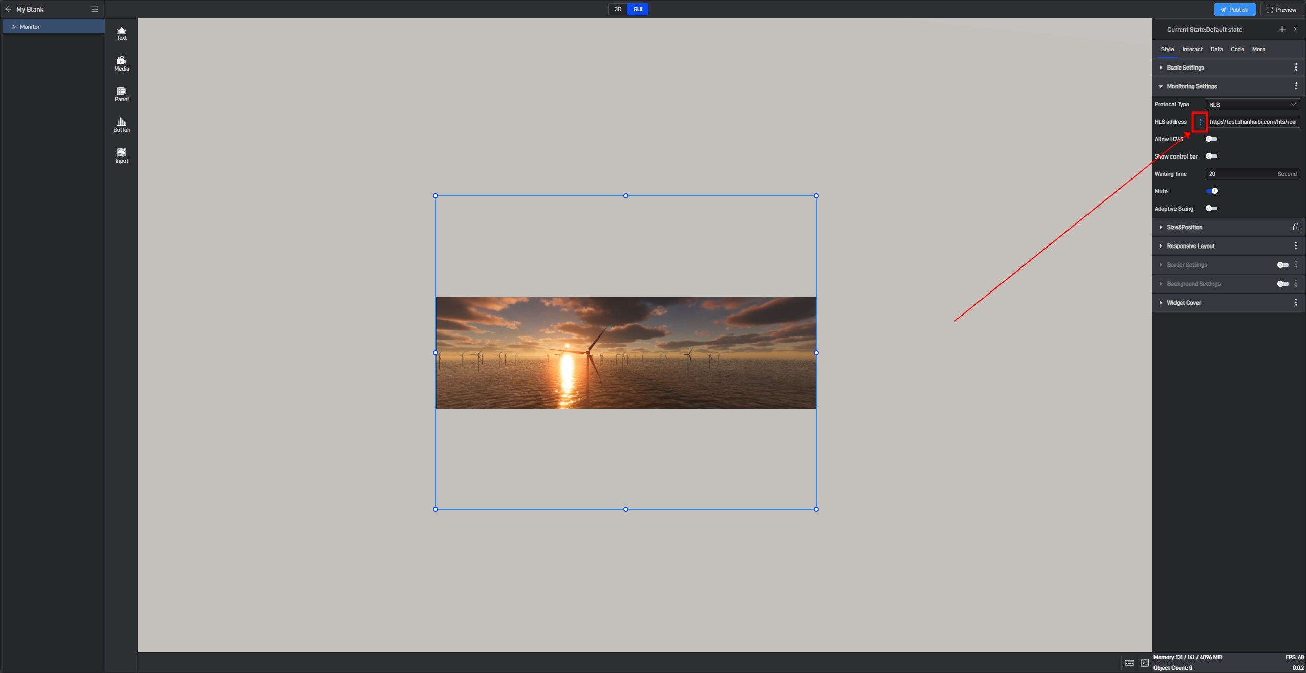
Click these three dots to open the extended settings window, where the first option is “Conditional Style” .
Additionally, you can open the extended settings window by right-clicking the setting item.

Click “Conditional Style” to open the conditional style settings window.
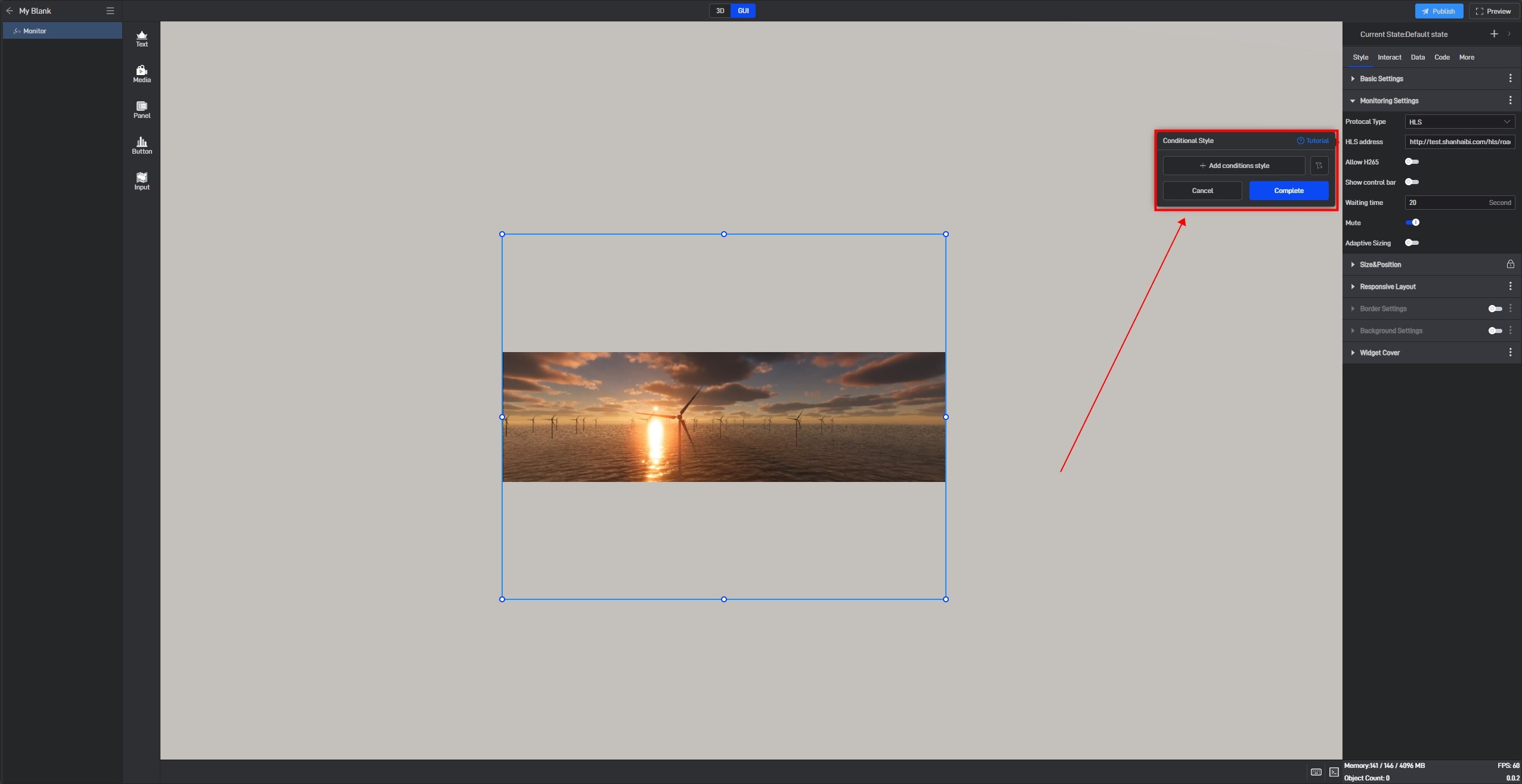
Click “+ Add Conditional Style” ,then select the data condition that needs to be triggered (the selectable data conditions must be existing data conditions).
Based on the current setting item, we can set the opacity value when Condition 1 is met, as well as the opacity value when no conditions are met.
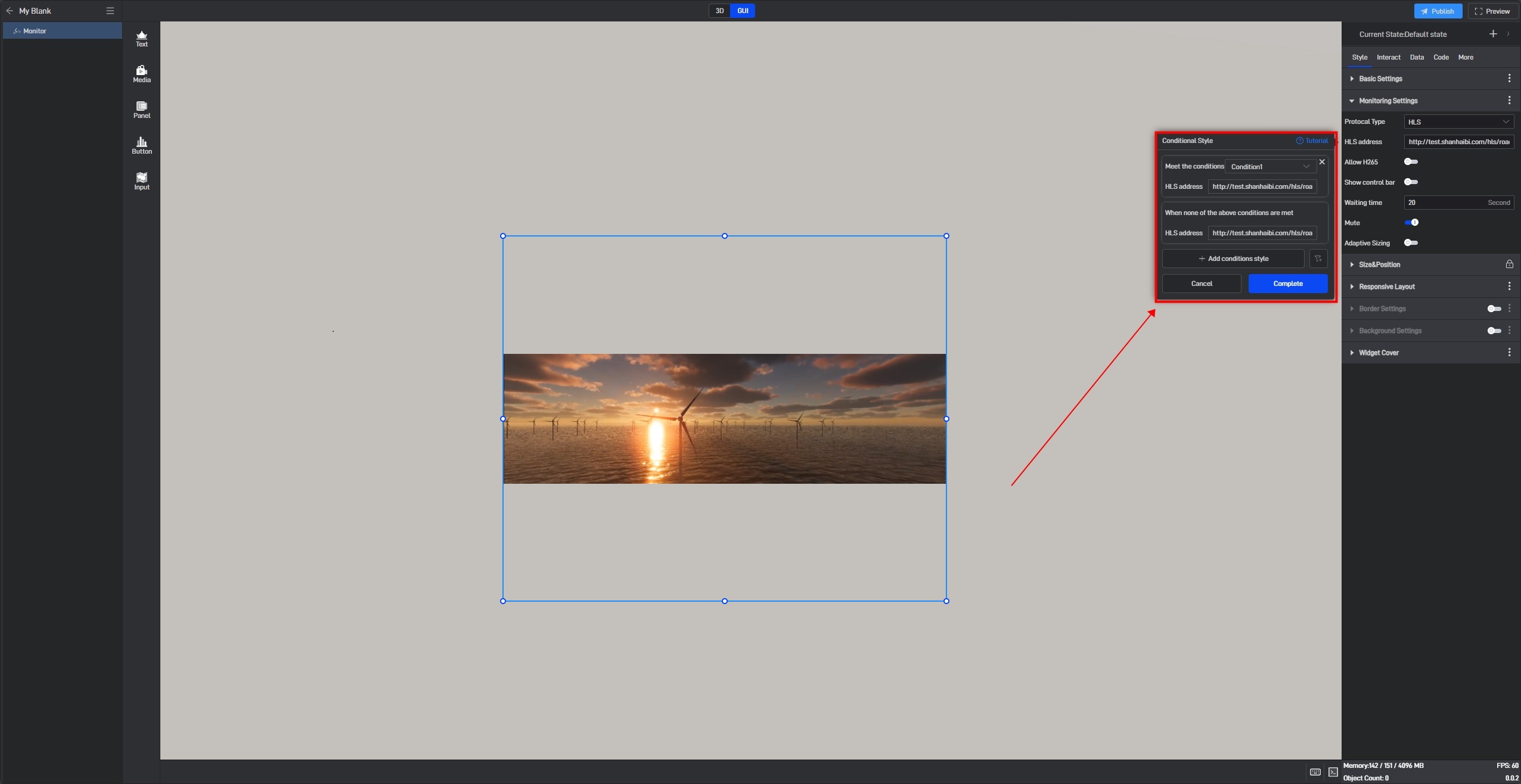
After setting, the setting item will show a “Conditional Style Enabled” prompt.
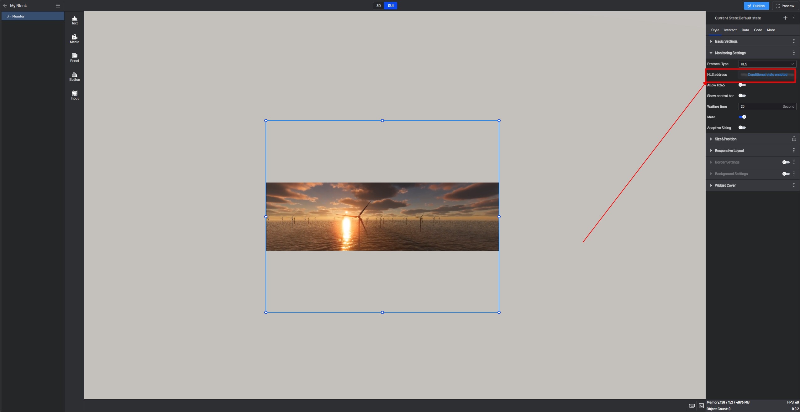
Method 2: Directly Set in the Setting Item
Some settings have conditions that can be configured directly within the setting itself, allowing for direct adjustments. However, the conditional styles of monitoring components can only be configured using Method 1.
3.3 Setting Styles via Data Fields
All modifications to setting items are essentially value changes, so all setting items can be controlled through data fields. The dynamic data field function is needed here.
Still taking the “Opacity” setting item in “Basic Settings” as an example:
Open the extended settings window and click the third option, “Generate Data Field”.
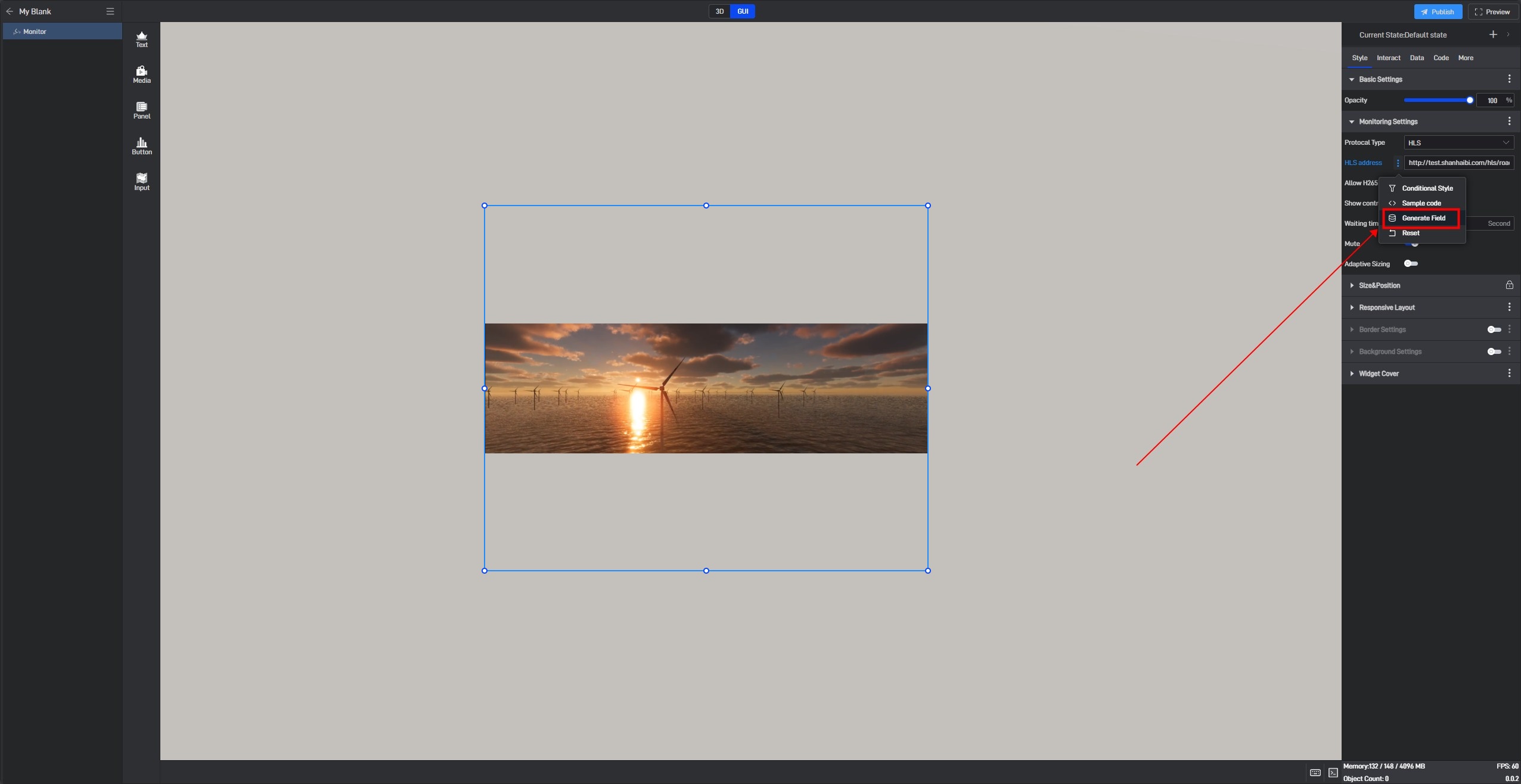
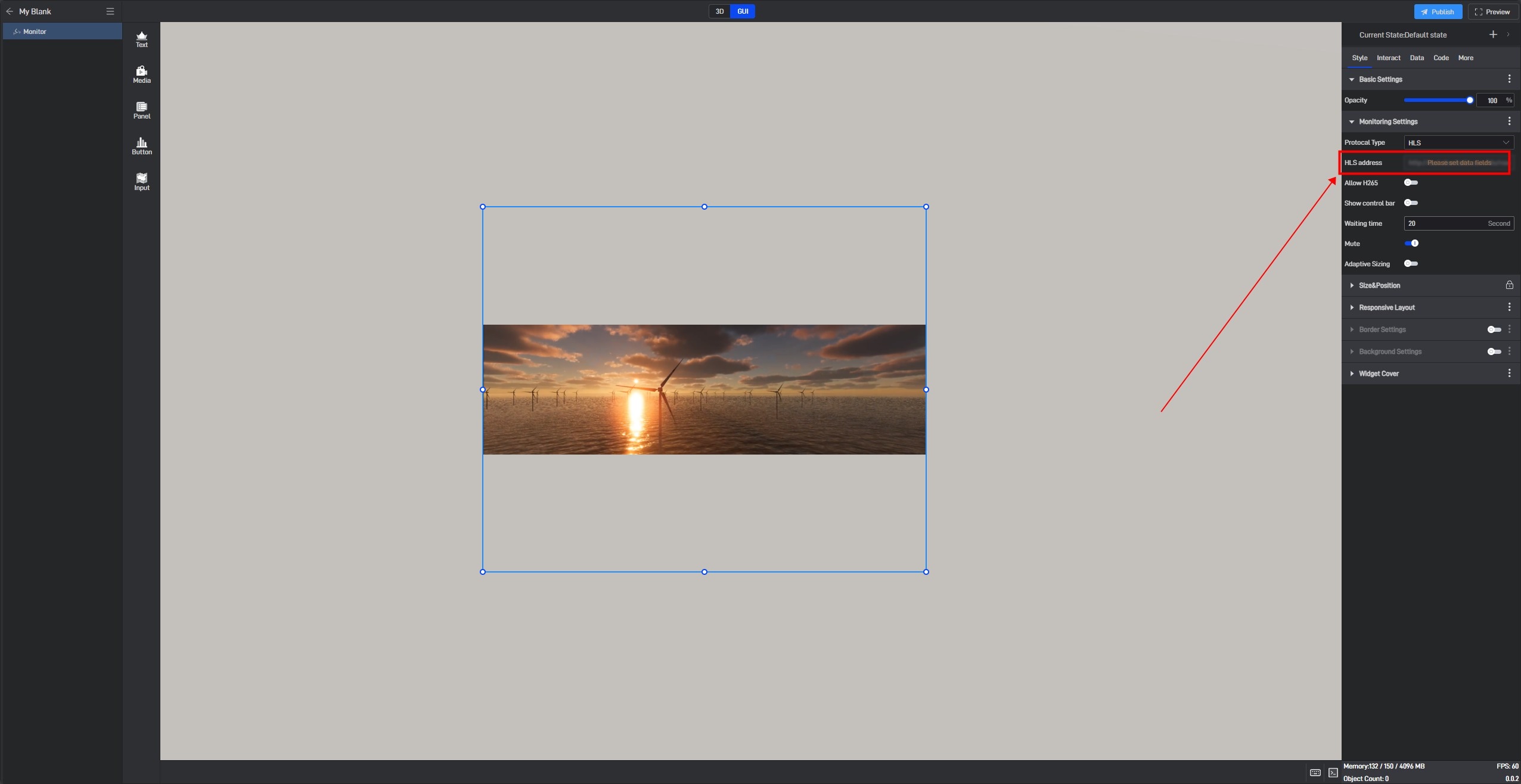
After clicking, a prompt saying “Please set data field” will appear for this setting item.
Switch to the “Data” settings interface. At this point, you will see a newly added “Dynamic Data Field” setting item, and a related field has been generated for the previously selected “Opacity” setting item.
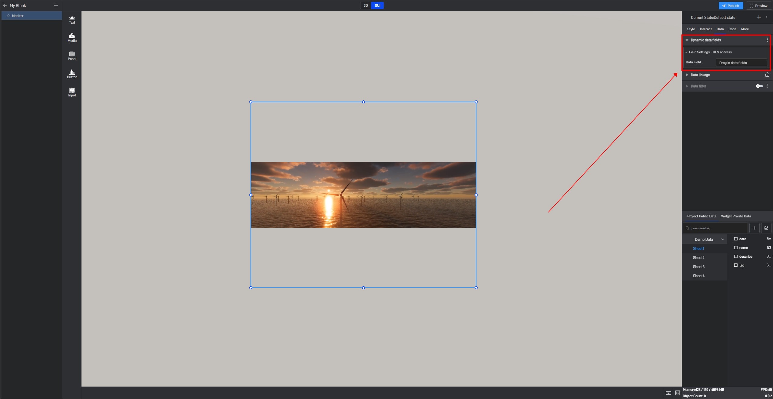
Next, simply add a data field here, and you can control the opacity through data.
Adding a data value of “0” to the data field will change the opacity value to “0” via the dynamic data field, thereby hiding the component.

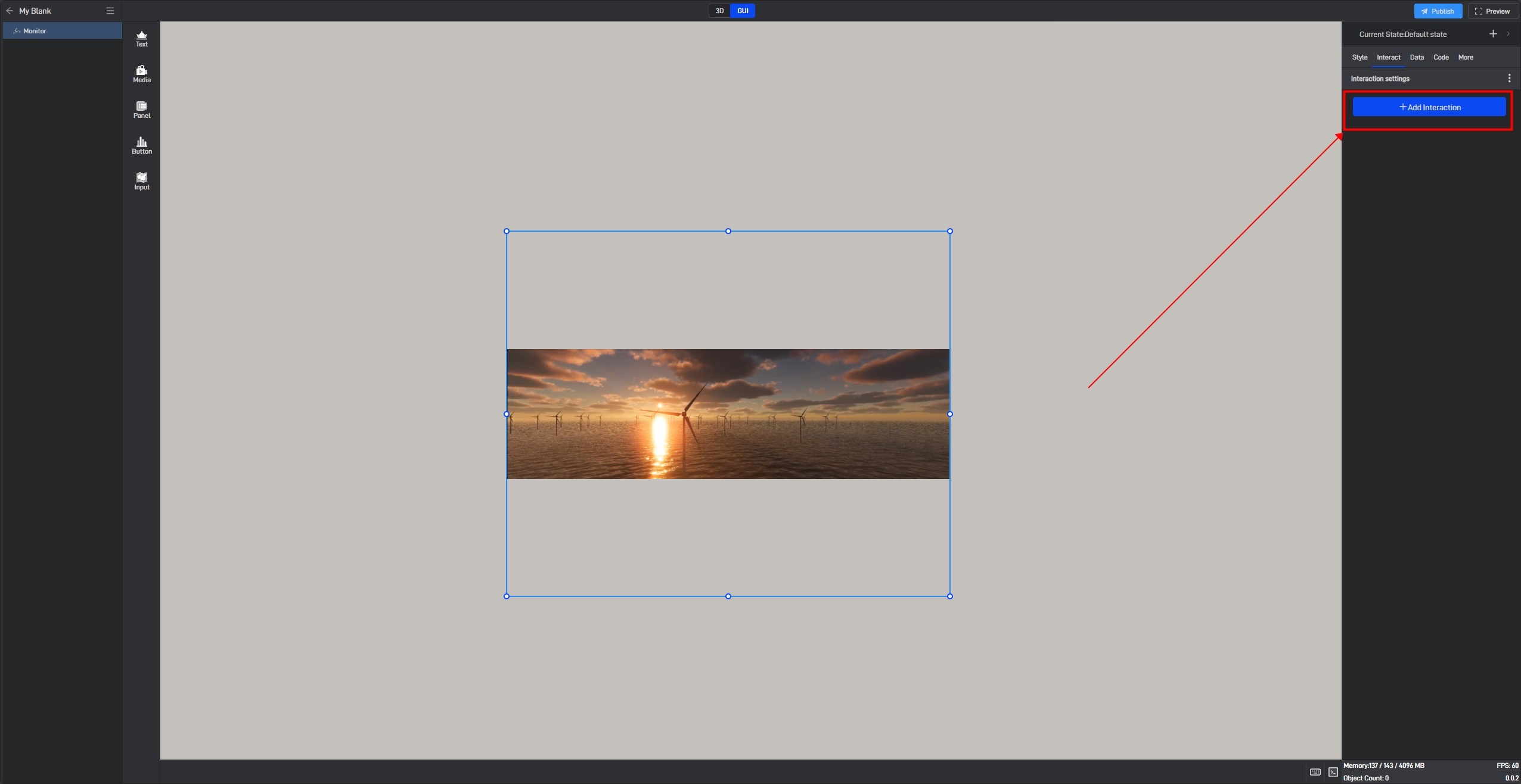
4. Set interaction
Click to select a widget, and in the “Interact” setting window on the right, you can add or delete interactions for the current widget.
5. Secondary Development
Click on the widget to select it, and in the right-side “Code” settings window, you can configure secondary development settings for the widget.
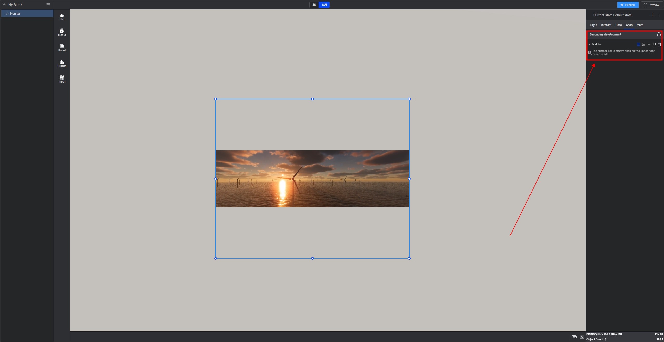
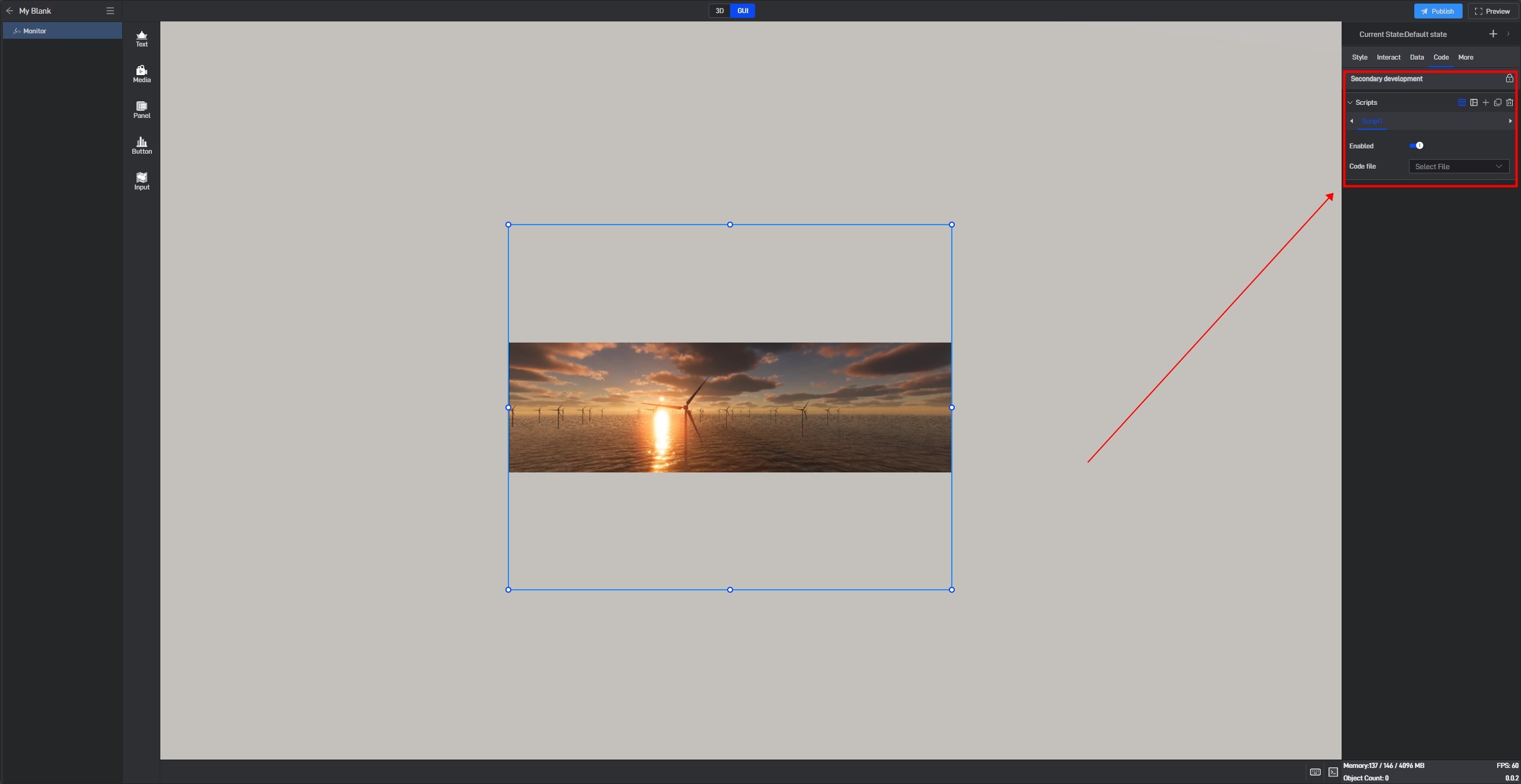
Secondary development needs to be achieved by loading JavaScript script files.
Click “+” to add settings. Multiple scripts can add multiple settings.
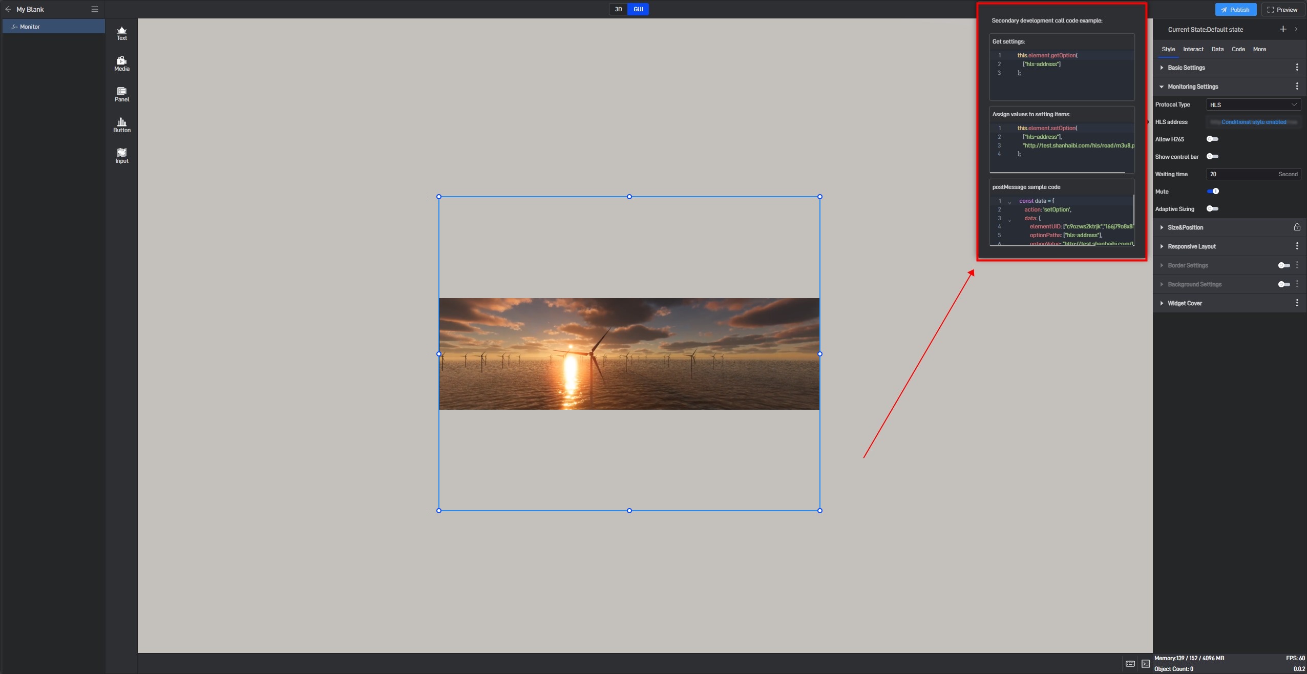
During the secondary development process, we can control the style of the widget. If we want to control a certain setting item, we can first view the secondary development code example of the setting item in the style.
Take the “Opacity” setting item as an example:
Open the pop-up window of the extended settings and click “Sample code”.

You can see the secondary development code sample for this setting item.
Here is a simple secondary development example:
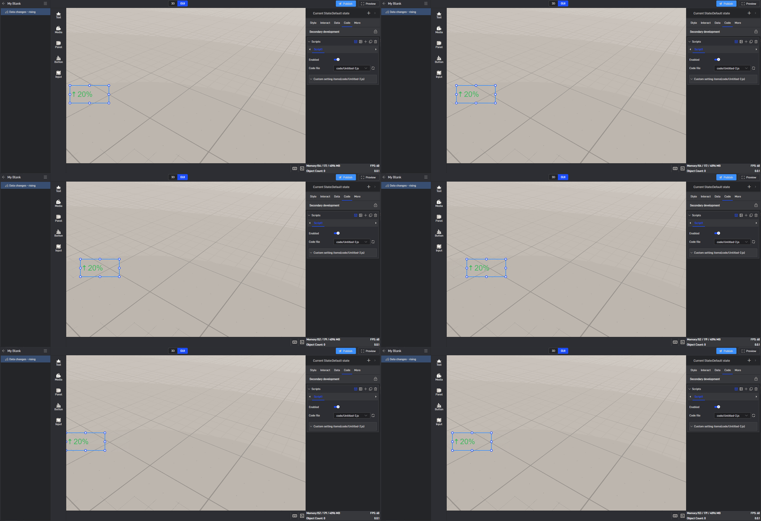
Secondary development function: widgets automatically move to the right
Sample code:
1 | /** |
Click “Select File” to add the JavaScript file.
6. Set up multi-state switching
6.1 Add states
Each widget has a default state property, which contains all the above settings.
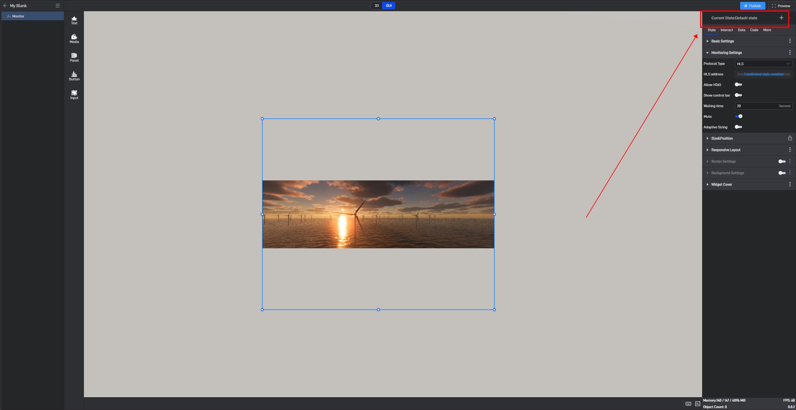
But we can also add multiple states, so that each state will contain all the above settings, and these states are independent of each other.
We can add new states in the following two ways:
6.1.1 Create a new state
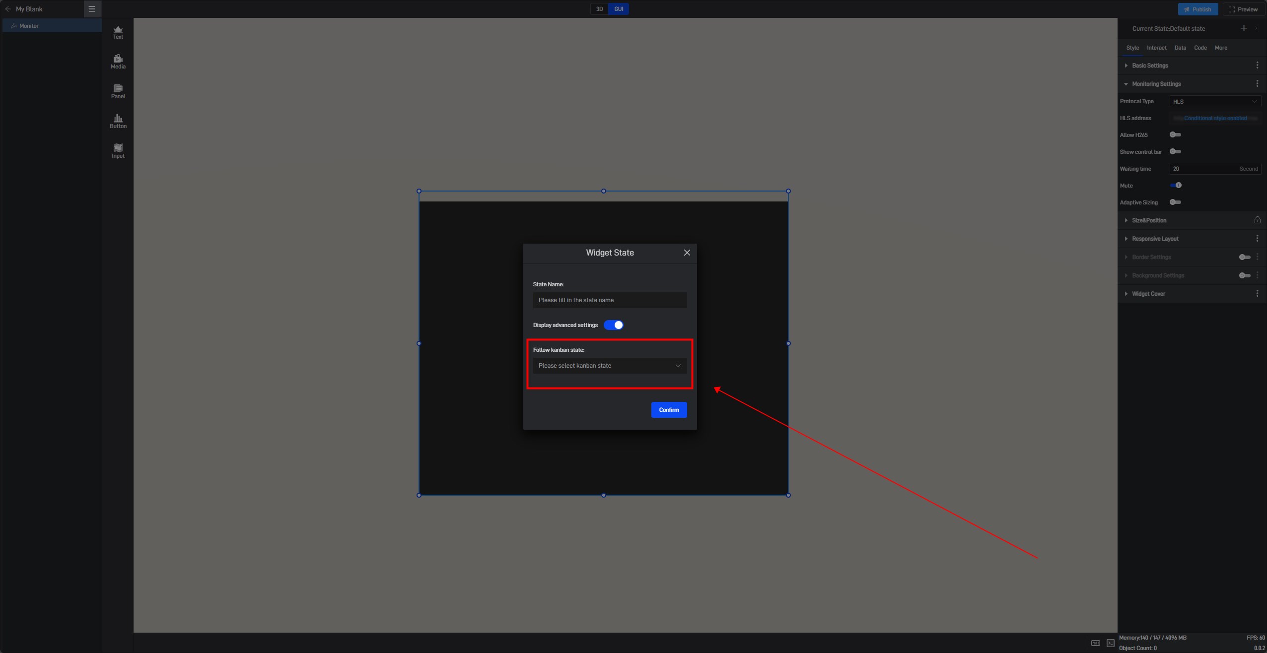
Click the “+” in the upper right corner to add a new widget state.
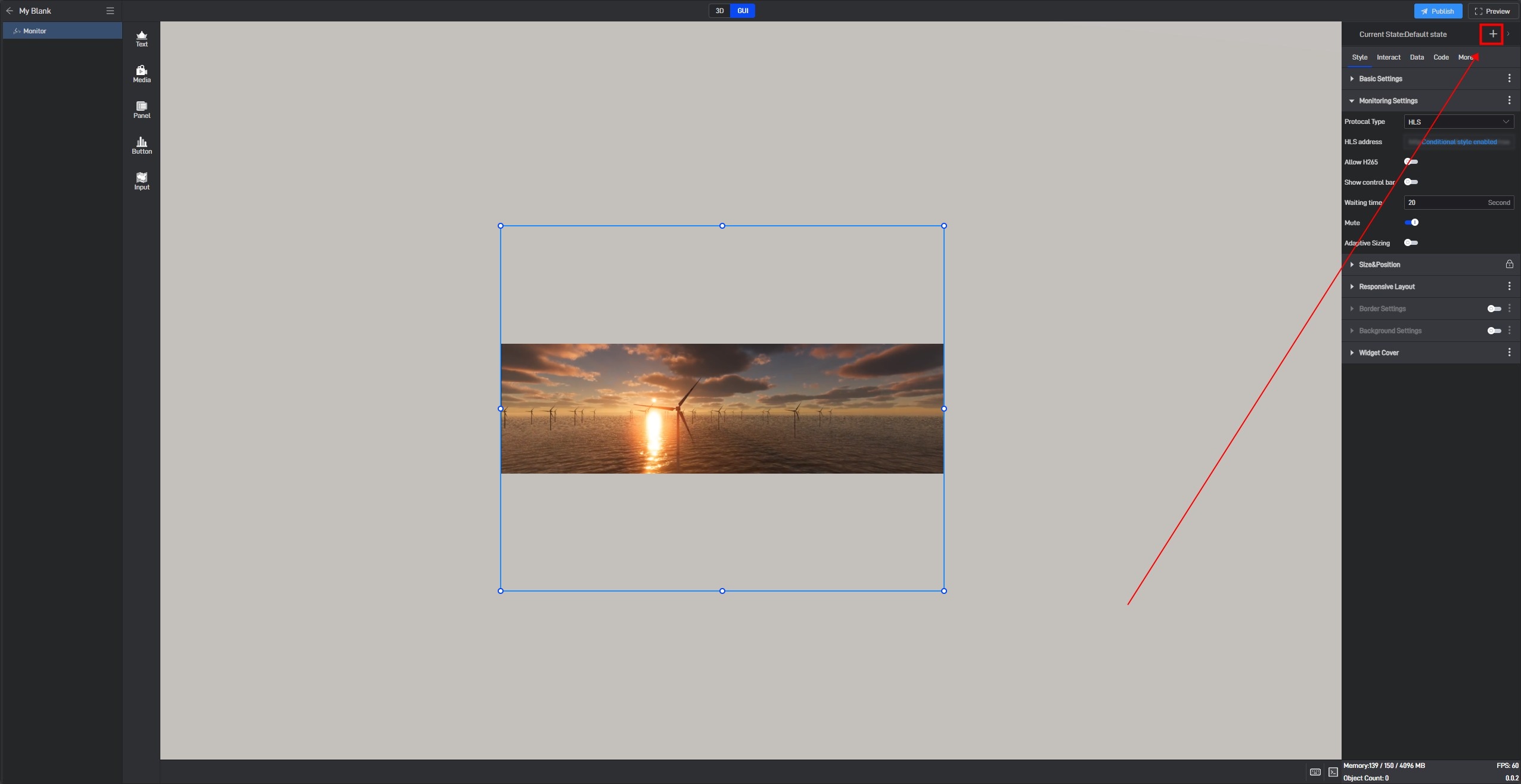
In the state setting window, we can set the name of the state.
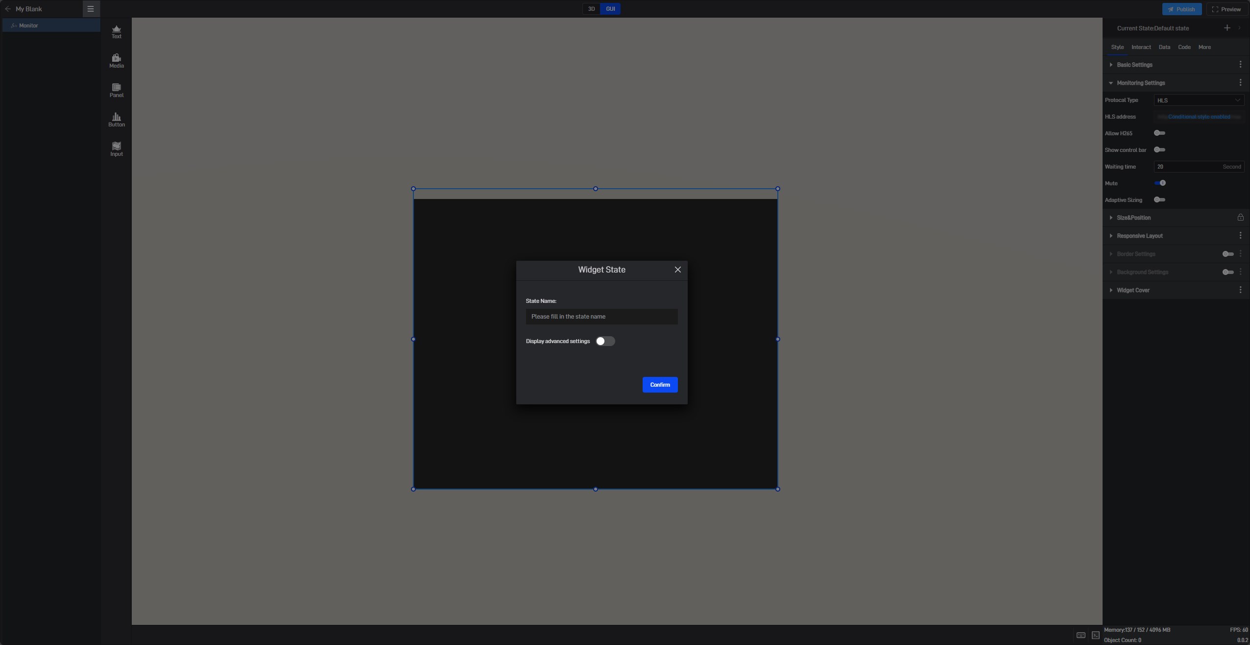
By default, all new states are kept consistent with the default state.
We also open the advanced settings in the window to set the follow object of the new state.
6.1.2 Copy an existing state
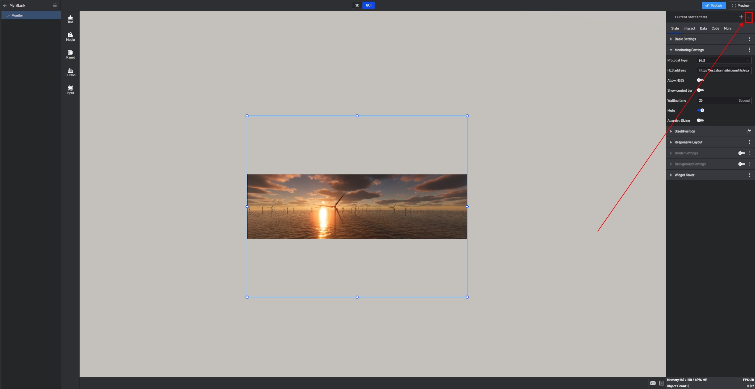
Click the state name in the upper right corner to expand the state list. After expanding, you can see all the states of the current widget.
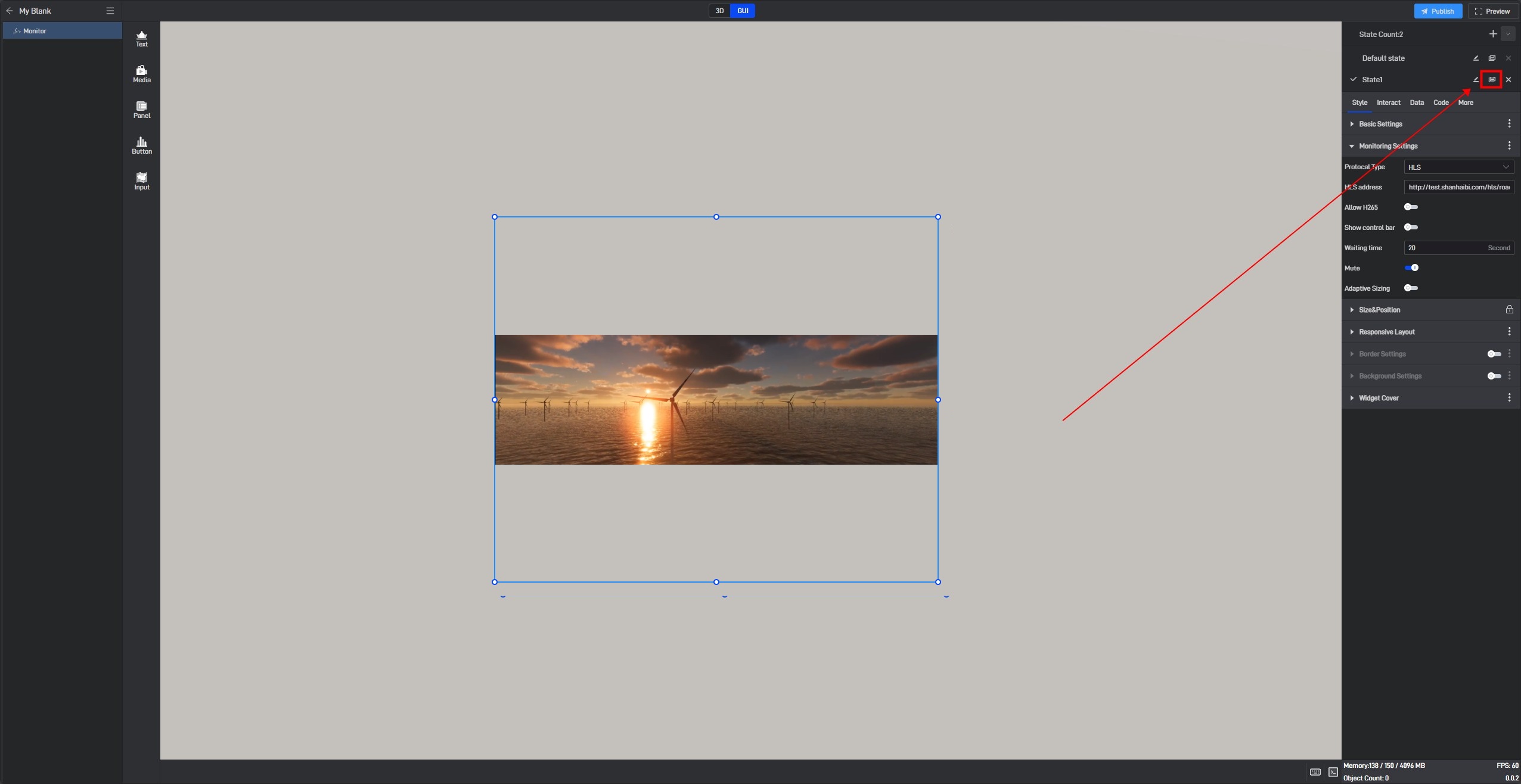
In this state list, we can rename, copy and delete the state.
Click the copy button on the right side of the state name to copy the current state to a new state. All settings of the copied new state will be consistent with the copied object state.
6.2 Switch states
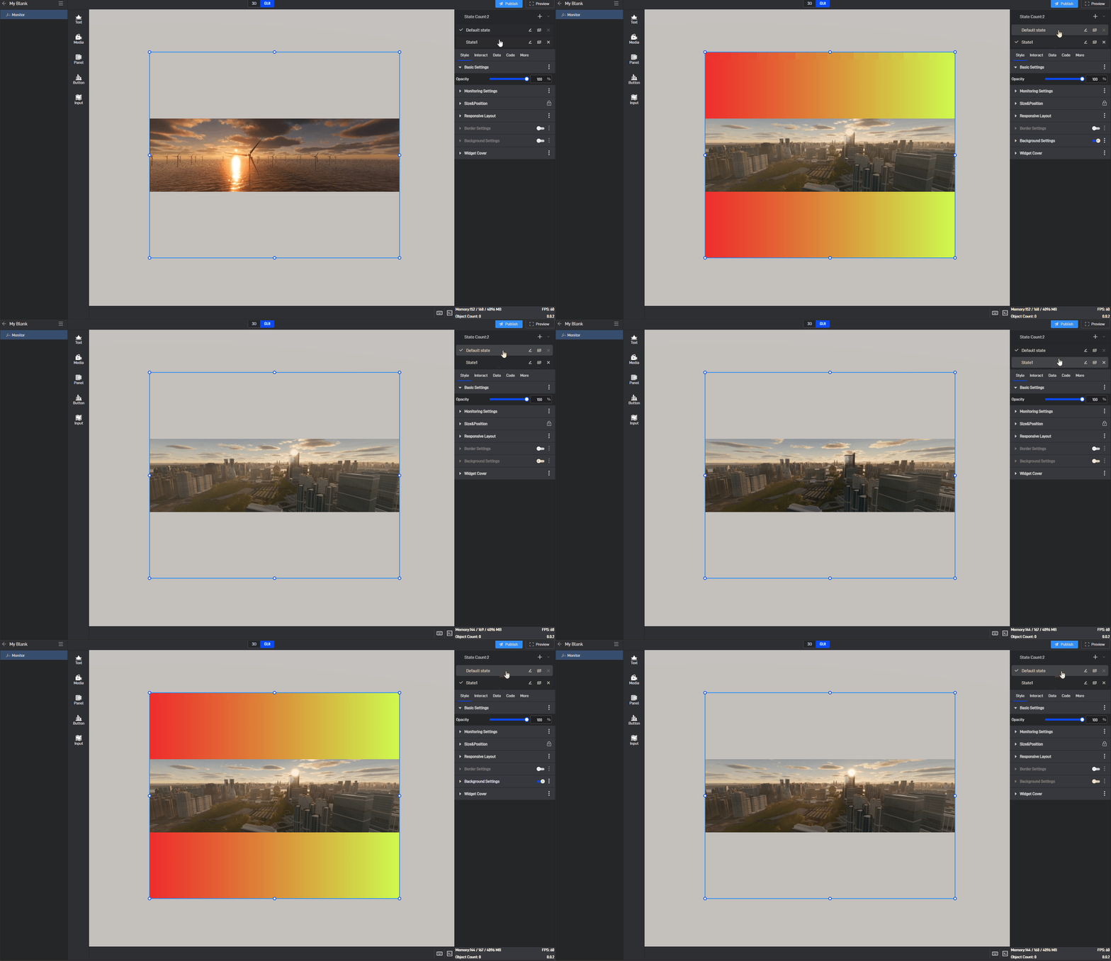
When editing a project, we can manually switch widget states by clicking on different states in the state list.
6.3 Locked state
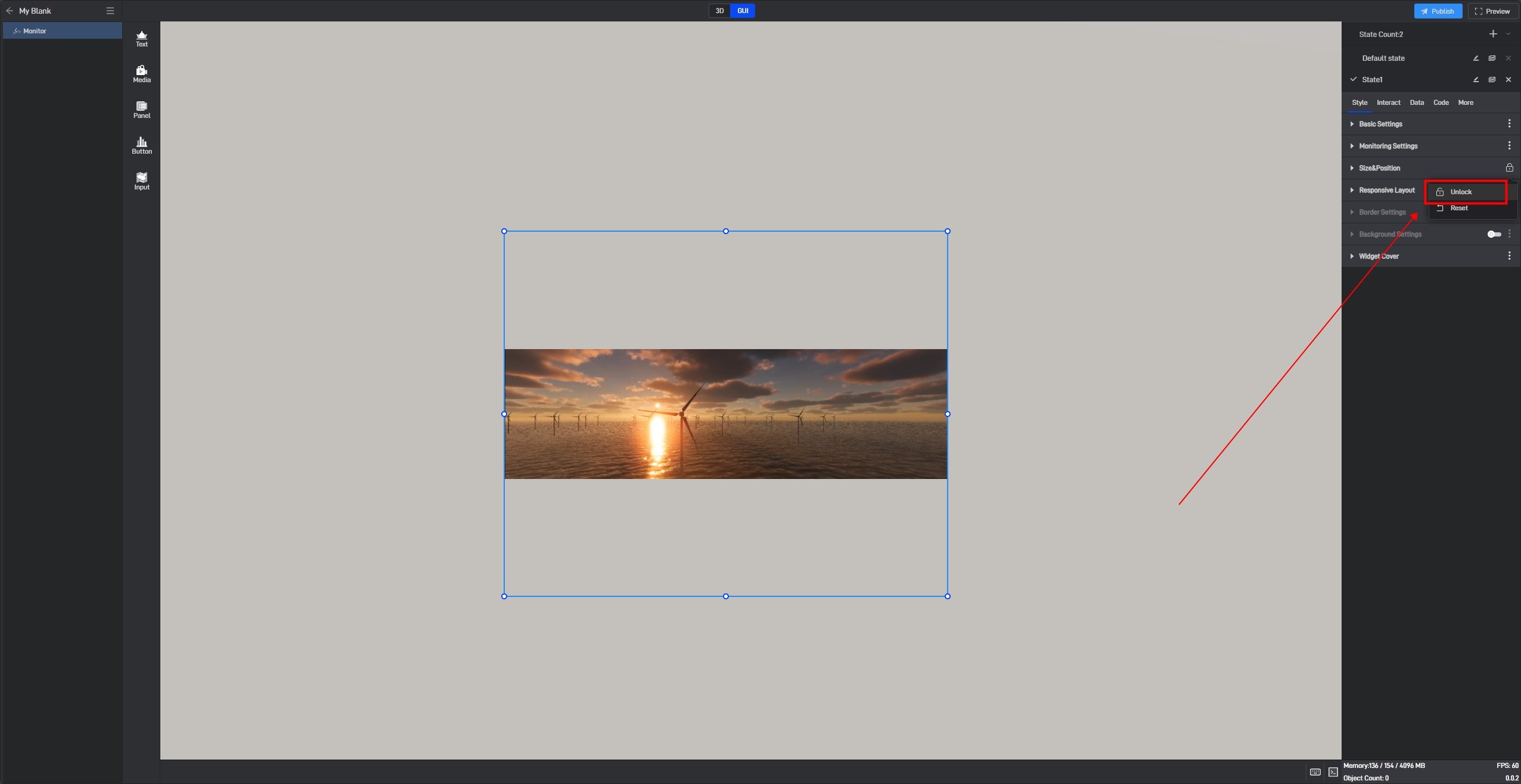
In the style settings, some settings have a lock icon on them, which means that this setting item in all current states has been locked to the default state, which means that if this setting item is modified, this setting item in all states will be modified uniformly.
This is a function that allows you to uniformly modify the same setting items in multiple states in a widget’s multiple states.
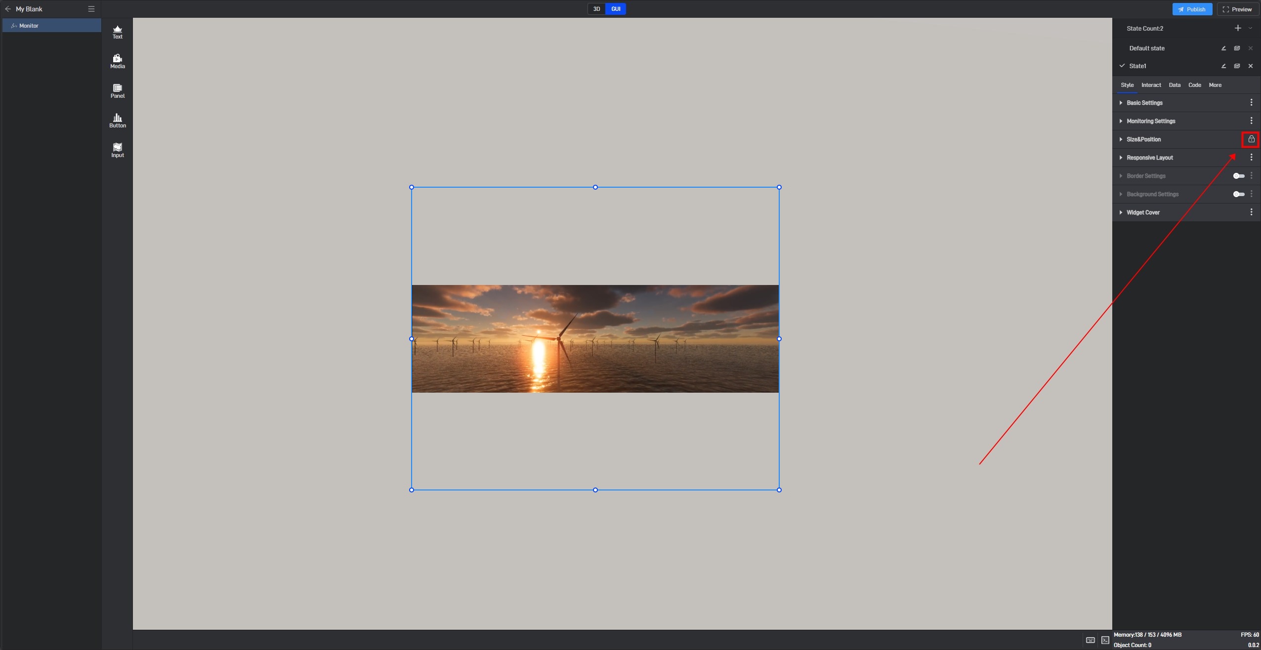
If you don’t want to lock it, you can click to unlock it, and then this setting item in all states will be unlocked.
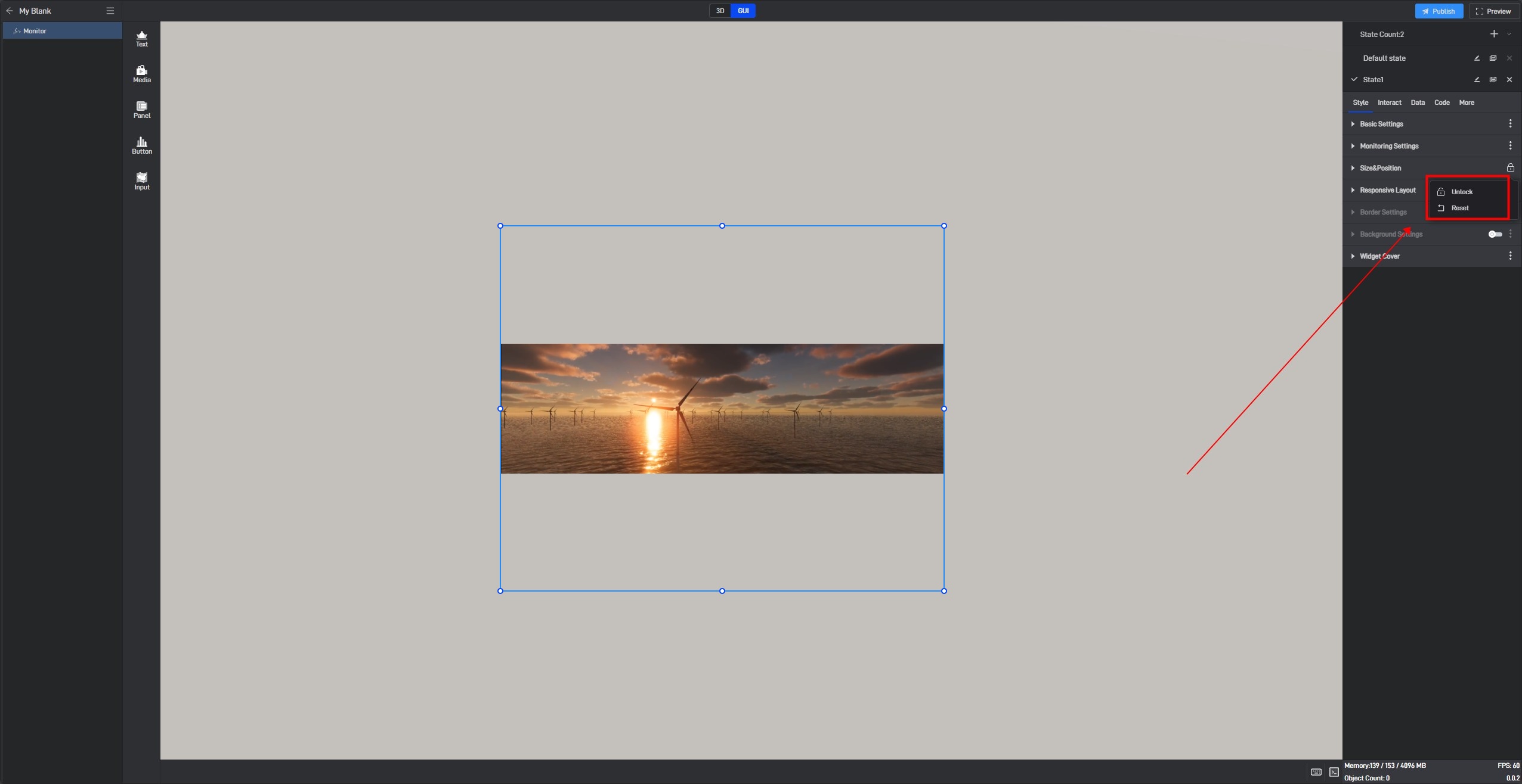
If you want to lock other settings, you can click the three dots on the right side of the setting item and then lock it.
